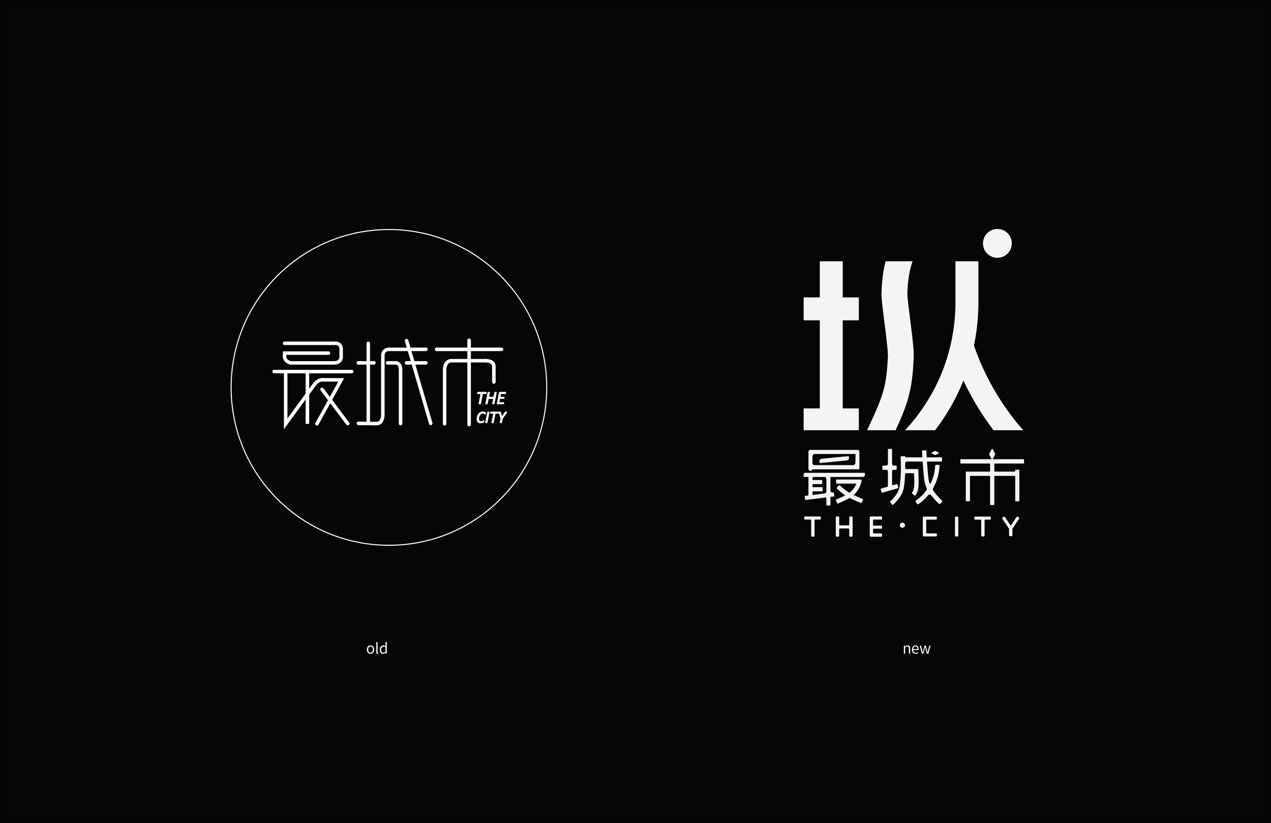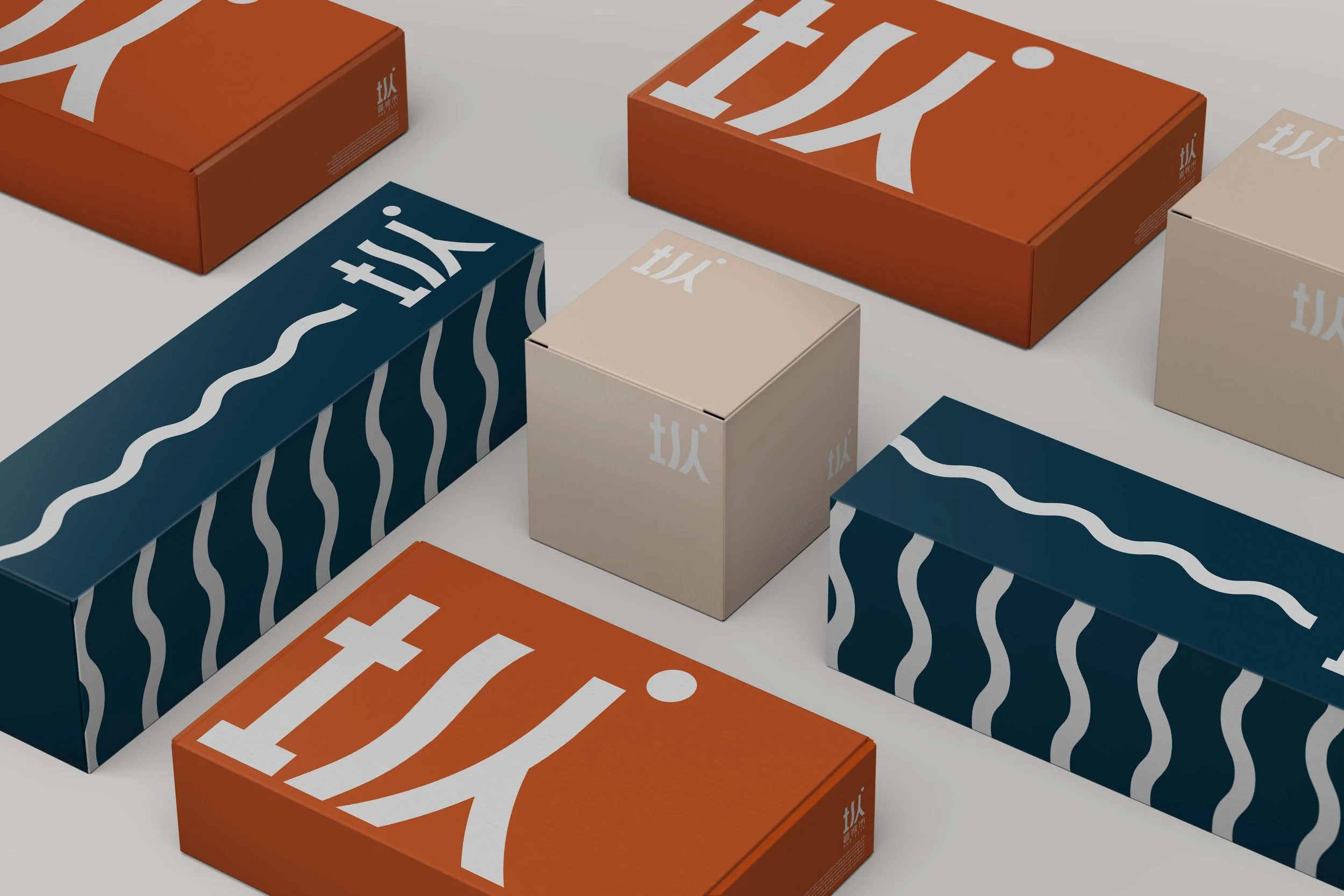
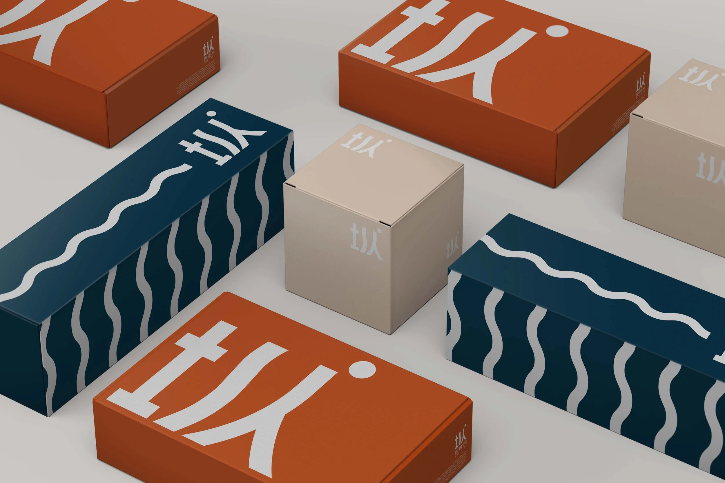
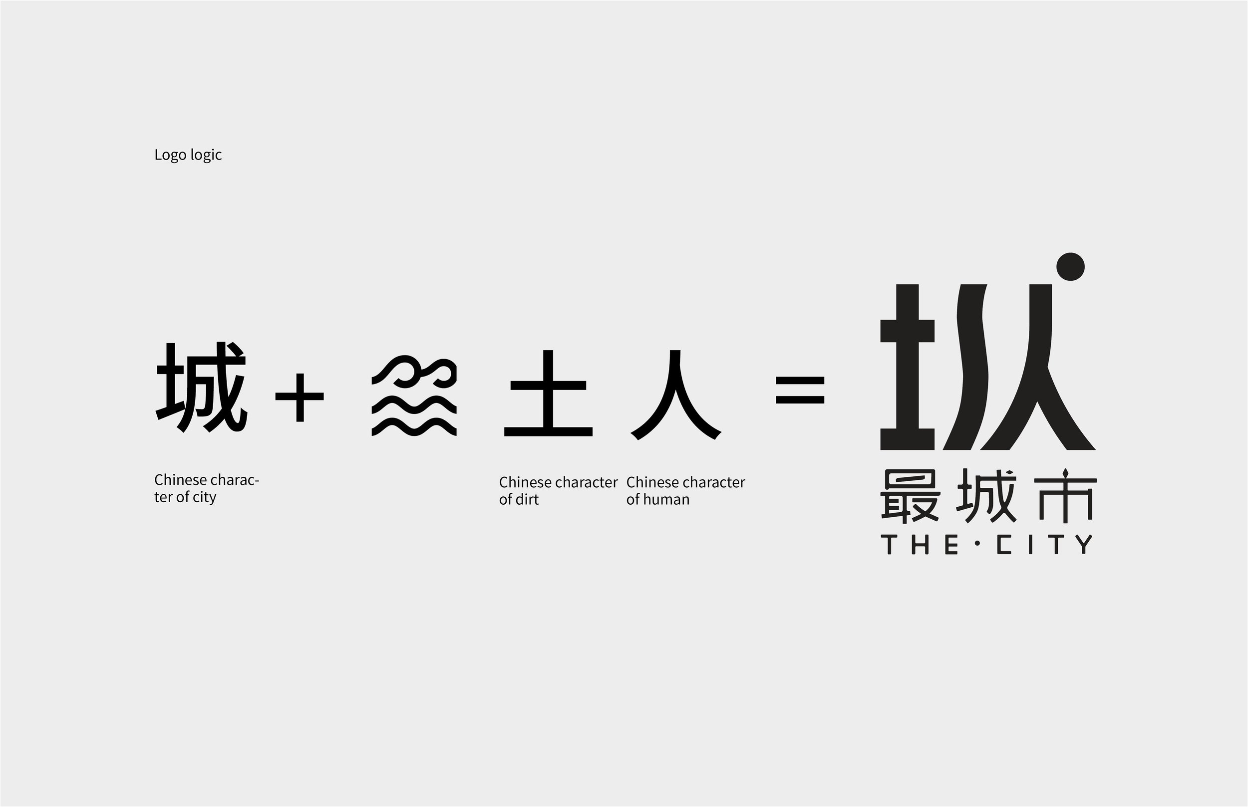
The rebrand of a cultural media company explored the intersection of tradition and modern storytelling. A logo inspired by the company’s slogan incorporates symbolic forms that echo the structure of a Chinese character and the spirit of a city. Complemented by a symbolic three-hue color palette, the new identity captures both cultural depth and contemporary appeal.
Orange background with white text and Chinese characters, reading "The City."
The image displays a modern logo design with Chinese characters and their English translations. The Chinese characters represent 'city,' 'dirt,' and 'human,' combined to form a phrase related to the city. The logo includes text in English that reads 'THE CITY' beneath the Chinese characters, with additional small English descriptions explaining the characters.

Logo Logic

Comparison of old and new logo designs for 'The City' with Chinese characters, showing a transition from a thin-lined, circular logo to a bold, block-style logo on a black background.
A collection of colorful boxes with modern, abstract designs and the text 'tix.' in various sizes and orientations.
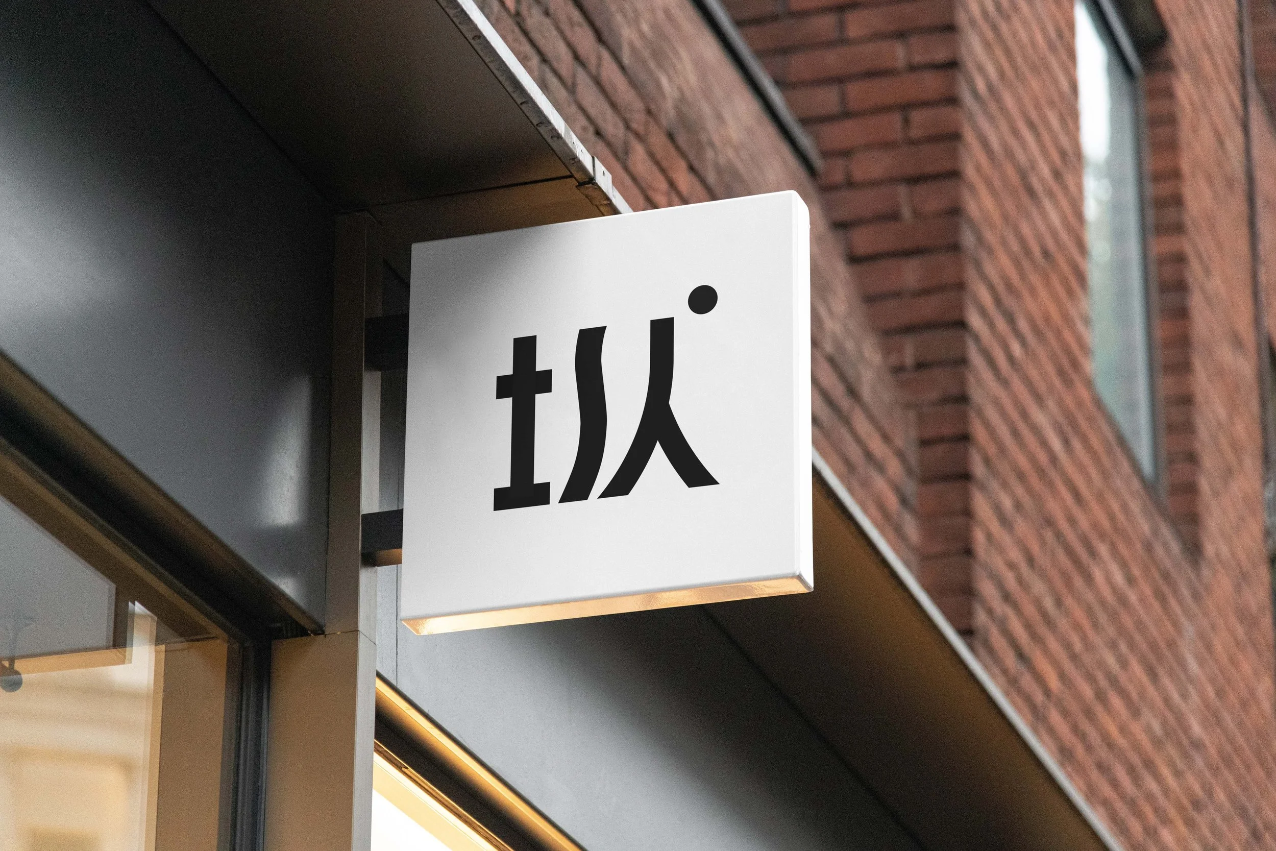
Close-up of a sign with Asian characters on a building with brick walls.
Multiple orange cardboard boxes with white cross symbols on top, arranged on a dark blue surface.
Colorful packaging with modern design and Chinese text on business cards, featuring a minimalist style with geometric shapes